
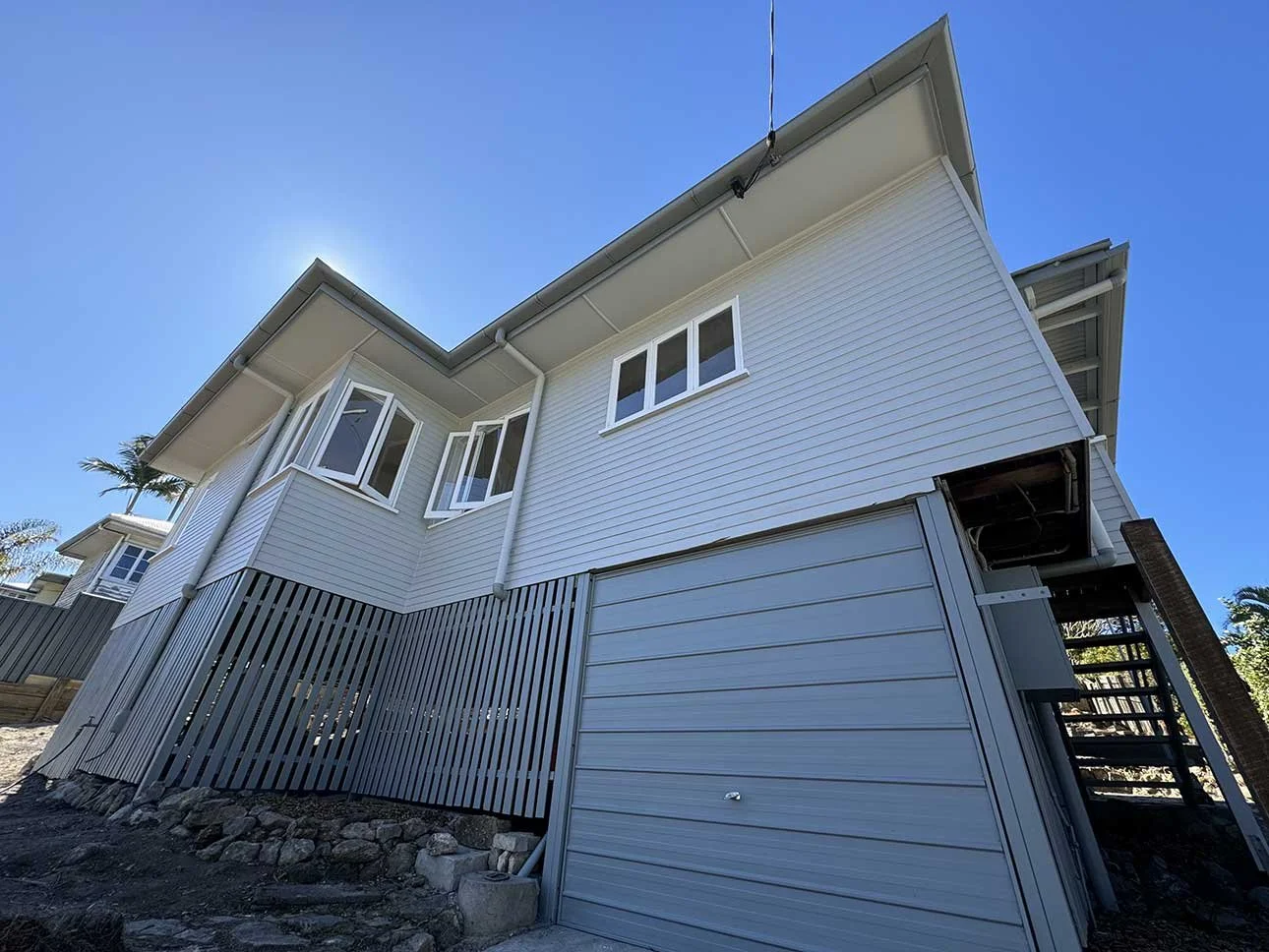
Modern Queenslander Exterior Colour Schemes
Queenslanders and coastal living go hand-in-hand, but that doesn’t mean the colour scheme has to stay stuck in the past! These iconic homes can look incredible with a modern coastal palette, and from muted blues to soft whites and sandy tones, there’s plenty of inspiration out there to give your home that relaxed, fresh-off-the-beach look while still honouring its heritage. But where do you start? Below, you'll find all the inspiration you need.
What Are the Most Popular Modern Queenslander Exterior Colour Schemes?
So, what’s trending when it comes to Queenslander colour schemes? The answer is a mix of modern neutrals, subtle contrast, and colours that highlight heritage features without feeling old-fashioned. From fresh whites to deep charcoals and soft greens, here are the palettes Queenslander owners are loving right now.
A Modern Spin
If you’re looking for a colour scheme that feels fresh but still respectful of traditional Queenslander style, use 'Oyster Linen' as your base and layer it with 'Colorbond Woodland Grey' for accents like roofing, gables or fencing, giving it that unmistakable modern edge. Finish with 'Lexicon Quarter' to brighten up trims and railings, tying everything together in a crisp, clean way. It’s a smart, timeless combination that won’t date anytime soon.
Timeless Neutrals with a Soft Edge
A combination like 'Natural White' on the main weatherboards creates a crisp, clean base that’s ideal if you're after a classic, timeless look. And when you pair it with the earthy warmth of 'Topelo Honey' for verandah ceilings or accents, and finish with 'Ticking', a deep, moody grey for trims, balustrades or even the front door, you'll have a trio feels that feels modern and balanced.
Fresh Greens & Clean Whites
If your home is surrounded by greenery, or if you want to bring the outdoors in, consider a nature-inspired scheme. 'Jungle Cloak', a rich olive green, looks amazing on weatherboards and blends effortlessly with tropical gardens. Contrast it with 'Pale Tendril Quarter', a soft, pale sage green that works beautifully on trims and shutters, then tie it all together with 'Lexicon Quarter', a popular cool white that keeps things light and modern. This palette feels grounded but still bright, making it ideal for homes near the bush or beach.
Cool Contrast with High Impact
Want your Queenslander to make a statement from the street? A high-contrast combo of soft and dark tones will give your exterior some real drama! 'Pre School Half' gives you a gentle grey blue for the main exterior, and you can add depth with 'Klavier', a bold, deep charcoal that’s perfect for trims, window frames, or fretwork details. To soften things and create balance, go with 'Natural White' again for posts, balustrades or verandah ceilings. It’s a confident colour story that still feels refined.
Pastels with Contemporary Flair
If you're not afraid of a little colour, pastel tones are back in a big way, especially when paired with contemporary neutrals. Start with 'Tranquil Retreat', a cool, calm grey that gives your exterior a relaxed coastal vibe. Then, use 'Pink Dust', but do sparingly. For example, it's ideal on the front door or window shutters, where it will add a playful, unexpected twist without overpowering anything. Then, balance it out with 'Snowy Mountains Half', a gentle off-white with just enough warmth to keep the look cohesive.
Deep & Moody
Darker exteriors are becoming very popular for Queenslander exteriors and, not without good reason. They’re sophisticated, striking, and surprisingly versatile. 'Teahouse', a deep, dramatic brown with grey undertones, makes for an incredible main colour on a Queenslander with strong architectural bones. With that as your base, bring in 'Oasis Spring', an almost-electric blue, for trims and fretwork to add contrast, then finish with Vivid White for doors, windows and posts to sharpen the overall look. This combo is both elegant and modern and perfect for homes that want to make an impact.
Choosing the Right Style for Your Queenslander's Exterior
While colour is a major player, your exterior's overall style is what pulls everything together. So, before settling on a colour scheme, it’s worth considering your location, surrounding landscape, and whether you want your home to blend in or stand out on the street.
Embracing the Classics with a Twist
The traditional Queenslander palette has long leaned into heritage colours like creams, greens, and soft browns. But modern updates are shifting things toward more subtle, sophisticated tones. For example, a crisp white with charcoal accents can elevate a home’s lines and let architectural features shine. Alternatively, reversing the palette with deep grey weatherboards and white detailing will add drama without compromising the home’s history.
Contemporary greys, off-whites, and even inky blues are now replacing those brighter, sometimes overly busy, period combinations. These shades still pay homage to tradition but bring with them a freshness and simplicity that feels very now.
Earthy Neutrals for a Natural Touch
If you're keen to reflect the natural Queensland landscape, earthy tones are a good way to go. Stone, clay, sand, and muted olives all work beautifully in both urban and coastal environments, making homes feel grounded and connected to their surroundings.
Using a soft earthy base colour for the weatherboards and layering it with white or timber trims creates a relaxed, welcoming effect, and this style pairs perfectly with timber elements like decks, screens or gables, which are often part of the original Queenslander design.
Coastal Cools with Soft Blues and Greens
Living near the ocean has a way of influencing colour preferences and, along Queensland’s coastlines, you'll see plenty of soft sea blues, gentle sage greens, and whites. These palettes feel fresh, relaxed, and in harmony with the lush tropical landscaping.
Light-coloured roofs, white trims, and blue-grey weatherboards combine to create a dreamy, beachy look that suits the warm, humid climate. These lighter tones are practical, too, as they reflect sunlight and help keep the home cool during those steamy summer months.
The Bold Statement Look
If you're after a more dramatic transformation, moody tones are having a real moment. Dark navy, charcoal, forest green, and even black can look absolutely stunning on a Queenslander, particularly when balanced with bright white trims or natural timber.
This approach suits homes with a strong architectural presence or those located in leafy areas, where the contrast can be softened by surrounding greenery. And with the right lighting and landscaping, a dark exterior feels contemporary, confident, and far from gloomy.
Softer Tones for a Welcoming Feel
On the other end of the spectrum, warm whites, soft blushes, and muted terracottas are making a quiet comeback. These shades work particularly well with Queensland’s golden sunlight, creating homes that feel sun-drenched and inviting.
They’re perfect if you want to keep things light but don’t love the starkness of pure white. And since warm tones also have a lovely calming quality, they pair beautifully with greenery, timber, and sandstone features.
Don't Forget the Details
While your weatherboard colour makes the first impression, it’s the smaller details that often leave the lasting one. Queenslanders are rich in features worth highlighting, including balustrades, fretwork, gables, and window trims, all of which offer an opportunity to bring depth and contrast into your palette.
Consider painting your gables or fretwork in a slightly darker or lighter variation of your main colour. Try a bold, contrasting front door to create a point of interest. Even your verandah ceiling can be an unexpected place to play with colours like light blues, pale greens, or soft pinks that can add personality without overwhelming the façade.
Roof colour, fence tones, and even garden landscaping should all play nicely with your chosen scheme, too. When everything works in harmony, the result is a home that doesn’t just look great, it feels cohesive and well thought out.
Climate Considerations
Queensland’s subtropical and coastal climate brings heat, humidity, storms and salt air, all of which can do a number on your paint job if you're not careful. That’s why choosing the right paint type and finish is just as important as the colour itself.
Lighter shades reflect heat, helping to keep your home cooler, while high-quality exterior paints designed for UV and moisture resistance will last longer and look better. Dark colours can absorb heat, so they’re best paired with good insulation and proper shading to avoid indoor temperature spikes.
Give Your Home’s Exterior a New Look with DC Decorators
Choosing the right colour scheme is one thing. Getting it professionally painted is where the magic really happens! If you’re ready to give your Queenslander a modern refresh, DC Decorators are the local experts to call. With experience painting classic homes across Brisbane we know exactly how to work with Queensland’s climate, building styles and latest colour trends. Reach out today for a free, no-obligation quote, and get ready to fall in love with your home all over again.