
Rendered house colour schemes: ideas and how to choose the right one
Choosing the right render colour for your home starts with considering the elements you can't easily change, such as your roof and the materials around your windows and doors. These features need to work together with the colour, and choosing a shade because it’s popular or going by a small sample you’ve only seen under store lighting is risky, as it can lead to unexpected results for your home's exterior.
Here, you'll find some of the render colour schemes Australian homeowners have been using for years and a practical way to choose one for your house. And, if you'd rather hand the project over to a team who have matched hundreds of Brisbane facades, DC Decorators can settle on a scheme with you and quote the job within 24 hours.
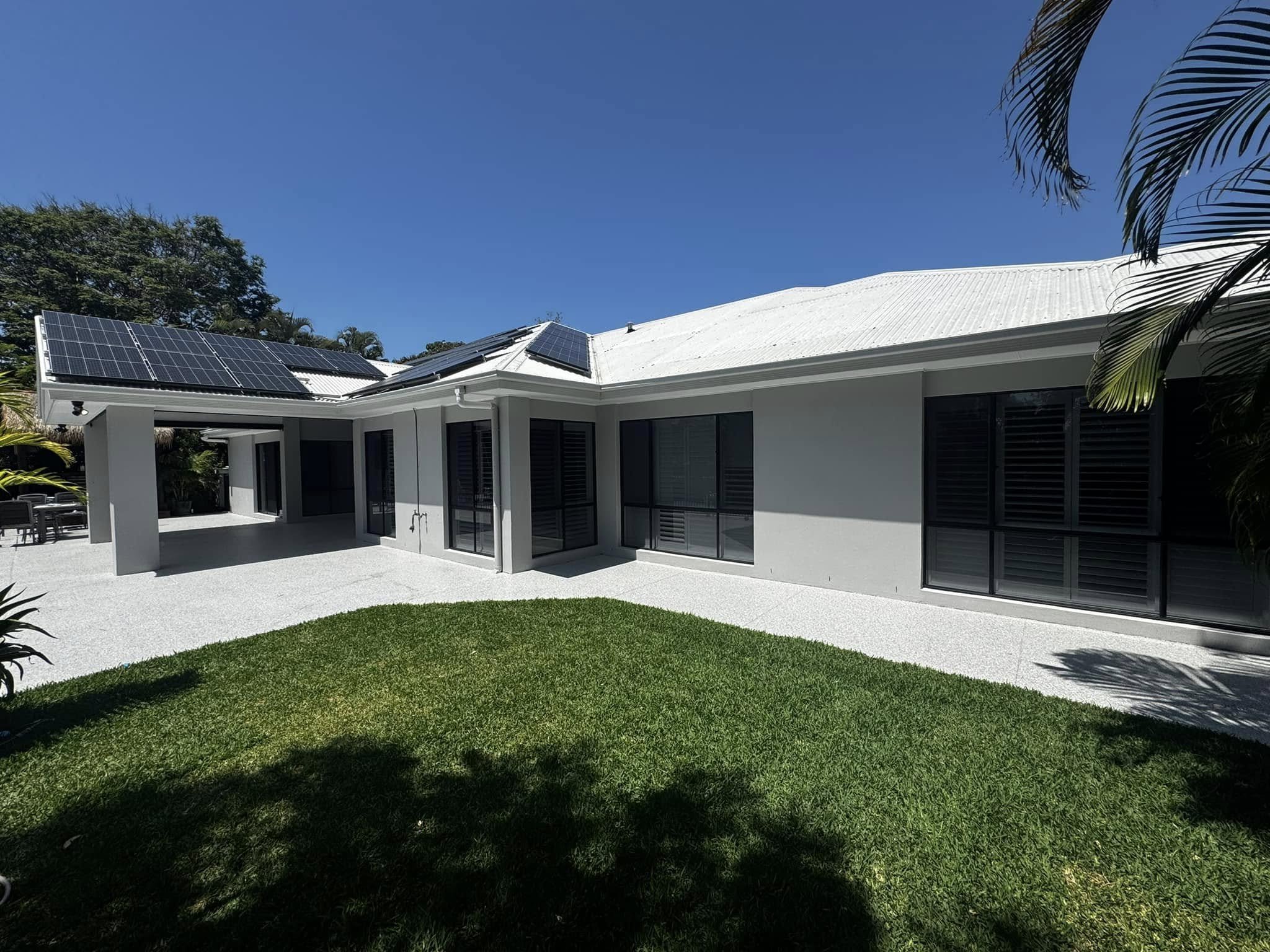
Popular render colours and colour schemes for Australian homes
Neutral and white renders
Neutral colours in home design have a timeless appeal, and they bring a gentle elegance to any space. Soft whites and warm creams pair really well with many roof colours, providing some harmony. An understated off-white keeps the facade looking fresh while avoiding an overly stark look. This colour choice enhances the look of classic Queenslanders and charming weatherboard cottages, while preserving their charm.
On modern homes, a crisp white render gives a sleek and contemporary feel to everything. But it's important to think about how bright sunlight might cause glare as it hits the bright white, and this can be avoided by choosing a slightly softer shade to ensure comfort and ease on the eyes.
Grey renders, from light grey to dark grey
Throughout the 2020s, grey has achieved a similar thing to what beige held in the previous decade. Light grey gives a soft, forgiving appearance that conveniently conceals minor imperfections, and its versatility really comes through when it is paired with a charcoal or Monument roof. As you move towards mid and dark grey shades, the overall look transforms into something more architecturally striking, especially when complemented by black window frames.
Grey can affect how warm your home looks, though. Cooler grey tones can appear dull on cloudy days, so selecting a grey with a warm undertone is usually a better choice for suburban homes instead of opting for a pure blue-grey.
Earthy tones and warm render colours
People are increasingly embracing warmer, earthier colours in their homes and stepping away from the cooler shades. Imagine the comforting tone of sandy taupes, gentle clay shades, and subdued olive greens, with an occasional splash of warm ochre reminiscent of the Australian outback.
These natural tones complement houses that are surrounded by native plants or with timber accents. They also have the added advantage of concealing dust and pollen more effectively than stark whites could ever try to. A warm render also enhances the appearance of brick and stone, which is particularly beneficial if you're only updating part of your home's exterior.
Dark render colours for a modern facade
Dark colours make a bold impression, especially when they are used on the right house. Think of a charcoal or almost black finish on a boxy, modern structure. When that is combined with timber and black steel, it creates a crisp, modern look that elegantly conceals dirt between cleanings. But there is a downside: these colours can absorb heat and tend to fade over time. You can avoid this by using dark shades on walls that don’t spend the afternoon soaking up direct sunlight.
How to choose the right render colour for your home
Match your render to your roof and Colorbond colour
Your home’s roof is the largest single area of colour and, ultimately, it dictates the whole look. If you choose an exterior render that clashes with it, you can disrupt the entire look, no matter how smartly you try to accessorise. A Colorbond Monument roof, with its rich charcoal grey shade, pairs beautifully with warm whites, soft greiges, and mid greys. It even complements a bright, crisp white.
Choosing a Surfmist or lighter roof can expand the palette of render colours available to you. However, if you choose a very pale colour for the walls, the overall look can appear washed out. To get the perfect combination, take a physical sample of the roof or a Colorbond swatch and then compare it with your render options in natural daylight. Colours can appear quite different in daylight compared to under artificial lighting, and the difference might surprise you.
Complement stone, timber and other exterior materials
When your home features stone cladding, timber battens, a brick base, or a standout entryway, each of these elements brings its own subtle hues. Your render should complement these tones to create a harmonious look. For instance, warm sandstone pairs beautifully with earthy or cream-coloured renders, while cool grey stones are best matched with grey or crisp white shades.
Timber is quite versatile and blends well with most colours, but a warm render can enhance its natural honey tones. The key is to align similar undertones. Match warm with warm and cool with cool. Mixing opposite undertones might leave your home's facade feeling slightly off, even if the reason isn't immediately obvious.
Use front doors and accents to add contrast
Now that you have decided on your render and taken into account the roof and any stone or timber details, it’s time to consider some contrast. Your front door makes the ideal platform for adding a little flair to your home’s façade without overpowering the whole thing. Painting your front door in navy blue, dark forest green, terracotta, or even just staining the timber could really help liven up a neutral render.
When looking at the accent points of your home, such as window frames, fascia, gutters, and the garage door, choose your colours wisely. Stick to just one or two shades in addition to your main render colour. This approach makes sure that the contrast looks intentional, not overwhelming. Getting that balance right will enhance your home's kerb appeal significantly. It is also a safe choice, as repainting a door is an affordable way to make changes if needed.
Dark vs light render: how colour affects heat in the Australian sun
Colour changes how your home looks, and it changes how the home behaves in the heat. Dark render absorbs far more of the sun's energy than light render, and in a Brisbane summer, that difference shows up on the wall and, over time, inside the house. A dark charcoal wall in direct afternoon sun gets seriously hot to the touch, and west and north-facing walls cop the worst of it.
When you use a lighter colour on your walls, you’ll reflect more heat away from your home, and that helps keep it cooler and can also reduce your reliance on air conditioning. Many houses in Queensland do have dark facades and still remain comfortable, but the secret lies in strategic colour placement.
Only use darker shades on walls that are mostly shaded or face south, while reserving lighter shades for areas that get direct sunlight throughout the day. This approach not only enhances the look but also contributes to energy efficiency.
Consider the impact of temperature fluctuations on your home's exterior, too. During the day, surfaces expand in the heat, then shrink as temperatures drop overnight. This constant movement takes a toll on darker surfaces, especially when paired with intense UV exposure, which can cause lower-quality coatings to wear out faster.
If your home is located near the coast, the salty air compounds the issue, adding extra stress to the already hardworking surfaces.
Common mistakes to avoid when choosing a render colour
One of the most common mistakes that people make is selecting a colour based on a single sample only. A small paint swatch will look totally different once it has been used for covering a whole wall. Colours are intensified when used at scale, and what may be a pale grey on a card will most likely turn into dark grey or black when applied to your house. You need to test a big patch of paint directly on the wall and look at it throughout the day to see how the light affects it.
Another mistake is overlooking how paint ages over time. Some paints and finishes fade unevenly, and cheaper dark shades can become chalky or patchy after just a few hot Queensland summers. Investing in a high-quality, UV-stable paint is worthwhile, as it will last much longer.
Dirt is another thing to think about when you’re choosing exterior paint colours. Lighter colours will accentuate every piece of dirt, mud stain, mildew, cobwebs, and even hose marks, particularly in garden or under-eave areas. Very dark hues are notorious for showcasing dust, salt residue, water spots, and even handprints. If you go for a mid-tone with warm undertones, it can help maintain a cleaner appearance for your home over time.
People also often make the mistake of choosing a paint colour without thinking about how the roof and other materials look in natural daylight. This oversight can unravel all the other careful choices made. So, always assess the entire palette together, outside, to ensure a harmonious look.
Get expert help with your exterior render colour scheme
Selecting a render colour might seem straightforward at first, but it quickly becomes overwhelming when you find yourself in the driveway with six sample pots and no clue which to choose. An experienced painter, who deals with this every week, can help you avoid the uncertainty and the expense of making a mistake on an entire facade.
For more than ten years, DC Decorators has been transforming homes throughout Brisbane, the Gold Coast, and the Sunshine Coast with expert painting and rendering services. We've learned which colours stand the test of time and which ones don’t. Our process involves a thorough examination of your roof, materials, house orientation, and the natural light it receives.
With these details in mind, we discuss options that enhance both the beauty of your home and its compatibility with the local climate. Every project comes with a five-year warranty and is fully licensed by the QBCC (15331027). If you're looking to choose a colour scheme that will still look fabulous in five years, contact us for a personalised quote, delivered within 24 hours.
Rendered house colour scheme FAQs
-
Soft neutrals and greys continue to reign supreme, ranging from warm whites to greige to mid and darker grey shades. The more earthy colours are becoming increasingly popular as cooler colour schemes fall out of favour. Darker grey charcoals are highly popular for contemporary builds.
-
A lighter coloured render is better at reflecting heat and keeping the home cool, so it is the better option considering the Queensland weather conditions. A darker render will absorb heat, making the walls and inside of the building feel hotter. You can, of course, use darker colours on walls, but just stick to areas that do not receive any direct sunlight.
-
Monument is a very dark grey colour and one of the more versatile roof colours that can be used. Warm white or soft greige colours complement Monument well when used together. Mid grey colours can also be used effectively with Monument. For a more contemporary appearance, dark charcoal paint complements Monument well.
-
Either works, but they do different jobs. A shade that is similar to the roof will give your building a calm and unified appearance, whereas a stark contrast, such as white walls against a dark roof, will provide definition and boost kerb appeal. What you should stay away from is the middle area of two colours that are similar but conflicting in undertones.
-
While all colours will fade with time under the Australian sun, the speed at which this occurs and how evenly it does so will vary considerably according to the colour selected and the quality of the paint used. Deep red colours and lower quality dark colours fade faster and less evenly. A quality, UV-stable product on well-prepared render holds its colour for years longer, which is where good prep and the right paint earn their keep.