
Weatherboard house colour schemes: ideas to suit your home
Selecting the right colour scheme for weatherboard houses is not as complicated as you might imagine. The first step is considering the materials that are already in your house, such as the roof and brickwork, and then taking into consideration the exposure to sunlight throughout the day, especially in Queensland. Then, consider that weatherboard cladding provides texture and shadowlines that affect how colours appear when compared to brick houses. With all that in mind, the choice starts to narrow down.
Below is a selection of the exterior colour schemes we see working on weatherboard homes around Brisbane, and how to actually decide on one for your house. If you'd rather talk it through with a painter who's stood in front of a few hundred weatherboard exteriors, we're happy to take a look.
Popular weatherboard house colour schemes
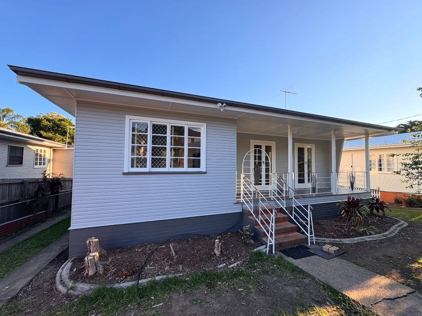
Most weatherboard exteriors can be classified into a handful of colour families. Here is what each scheme is for and the kind of house it fits best.
Crisp white and warm white schemes
White remains a top pick for Australian homes, and it’s not hard to see why. A bright white shade can provide a fresh, modern look, whereas warmer or natural whites bring a softer feel and do a better job of camouflaging dust and pollen: something that is an important consideration on a leafy street in Brisbane.
When you’re working with white weatherboards, the trick lies in creating contrast. You could pair white boards with a slightly darker trim, or reverse the idea by using white trims against a soft grey wall. If you use the same shade of white everywhere, it will most likely appear flat under sunlight.
Warm grey and soft grey schemes
For years, grey has been a favourite colour for exteriors, and it continues to be on weatherboard homes. Warm greys, mixed with hints of brown or beige, look great with timber and terracotta roofs, offering a cosy, inviting feel. On the other hand, cooler shades, such as shale grey, give a modern touch and pair well with charcoal or black roofs. Grey is also practical in bright sunlight, sidestepping the harshness that you get with pure white.
Monochromatic colour schemes
A monochromatic colour scheme gives you a way to add variety to a space without introducing any different colours. By mixing tones of the same colour for walls and trims, you’re able to create depth while still maintaining a cohesive look. This approach works particularly well in minimalist and modern homes, where you want a sleek, uncluttered look. For homes with weatherboard siding, the natural shadows between the boards add dimension, too, ensuring that even a single colour looks dynamic rather than flat.
Dark and moody weatherboard schemes
Rich charcoal tones and deep green shades can transform a weatherboard house and create a striking, modern look, especially when combined with sleek black window frames. However, in Brisbane, the intense heat and sun exposure throw up some unique challenges. Dark colours tend to absorb more heat, and less expensive paints could fade or chalk off after just a few years.
If you're thinking about using darker shades, make sure you invest in high-quality exterior paint that is designed to withstand heat. Also, pay attention to the orientation of your home, particularly which walls bear the brunt of the harsh afternoon sun.
How to choose a colour scheme for your weatherboard house
Start with your roof, brick and other fixed materials
Your home’s roof is the largest fixed element, and it dictates a lot about your colour choices. Unlike walls, you won’t be repainting it just to match other shades, and if your roof is a warm terracotta or brown, it would pair beautifully with warm grey tones or soft sage walls, but clash horribly with a cool blue-grey.
On the other hand, a charcoal or black roof complements cooler shades and clean whites beautifully. Also, if your house features a brick foundation or a stone chimney, these elements should be considered in your colour scheme as well.
The simplest method is to hold your shortlisted paint colour samples right up against the roof and any brick or stone, outside, in daylight. Look at the undertone rather than the surface colour. A brick that reads plain red often has a pink or orange undertone that will clash with the wrong white.
A colour wheel helps here: colours sitting opposite each other contrast, while neighbours on the wheel blend. You want your main colour scheme to sit in harmony with the fixed materials rather than fight them. This one step prevents more repaints than any other.
Match the scheme to your home's architectural style
When choosing colours for your home, you need to think about its age and the architectural style just as much as any current trends. A classic Queenslander or a worker's cottage showcases heritage shades and intricate trims, and some modern colour schemes may clash with the timber fretwork.
The classic Hamptons style embraces soft whites and pale greys, accented by sharp white trims. In contrast, a modern, box-shaped structure can handle a bolder or darker colour palette that might overpower an older home. Use the existing architectural features and details to decide how many colours to incorporate and how much contrast suits the space.
Factor in Australian light and your surroundings
Brisbane's sunlight is intense and direct, influencing how colours appear. Indoors, a grey might seem just right, but outside, it can fade to almost white on a north-facing wall by noon or take on a cool blue tone in the shade. Typically, when colours are applied to exterior walls, they look a shade or two lighter under full sun. To get the desired effect, it's wise to select a slightly deeper shade than what seems perfect in the store.
Your surroundings will also influence your choice. Imagine a house set beneath gum trees. It naturally feels cooler and greener. To create harmony, consider adding warm tones to your palette. If your home faces west, the intense afternoon sun can quickly fade dark colours.
If you live in an area near the coast, like Redcliffe or Gold Coast, the salty air combined with UV exposure can be tough on exterior paint finishes. To ensure you choose the best colours, paint large samples of your top two or three choices directly onto your walls. Observe these colours both in the morning and afternoon light before making a final decision.
Using accent colours to boost street appeal: front door, garage door and window frames
After deciding on the colours for the main walls and the trims, the smaller details truly bring a facade to life. The front door, for example, is often the first thing someone will look for when approaching your home. On a white or grey weatherboard house, a darker door colour creates a welcoming focal point.
This could be a deep green, a rich navy, a cosy timber stain, or even burnt orange if it suits the style of the home. Window frames in black or charcoal add cohesion to the overall design, drawing attention across the exterior.
Then there’s the garage door, which is easily forgotten about. In many homes, a large blank panel often sits prominently in front. Painting it to match the walls, instead of leaving it in its original factory colour, can instantly enhance the overall appearance.
It's important to keep the number of accent colours reasonable, though. Creating a quick vision board with your chosen wall and trim colours alongside potential accents, or even making a simple mock-up photo of your house, can immediately show if your colour choices work well together or clash.
Common mistakes to avoid with weatherboard colour schemes
Many people tend to select too many colours when painting their homes. It’s tempting to pick four or five shades from a mood board and use them all on the exterior. However, this often results in a chaotic appearance. For most weatherboard homes, sticking to two or three colours provides a harmonious look. You can always reserve any extra hues for a standout feature, like the front door, to add a touch of personality without overwhelming the design.
A close second is ignoring the roof. A palette chosen from an inspiration photo online might have sat under a totally different roof to yours, and it clashes the moment it goes up. Always bring the fixed materials into the decision.
Then there's poor sampling. Choosing off a paint chip the size of a stamp, or a swatch under shop lighting, is how people end up disappointed. Colours behave differently at scale and in Queensland’s sun. Sample big and on the actual wall, then look at it across the day. The last one is skipping prep to save money. Even a perfect colour looks poor over cracked filler or peeling boards, and it won't last. On weatherboard especially, the gapping, filling, sanding back and undercoating is what makes the finish sharp and keeps it there.
Ready to repaint your weatherboard exterior?
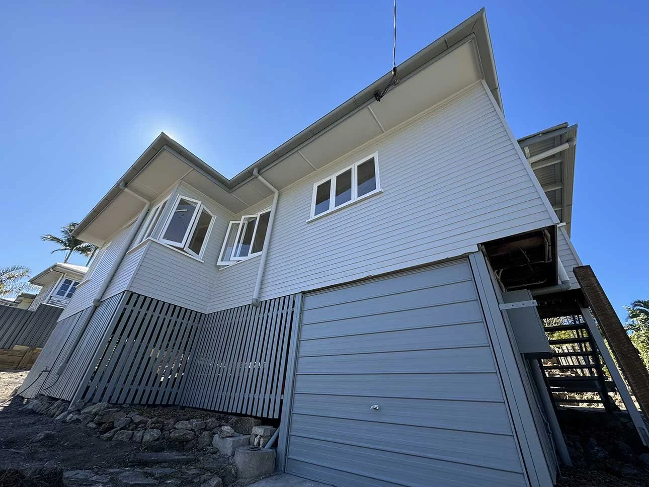
If you've landed on a scheme, or you're still weighing up a couple, we can help you pressure-test it against your roof, your light, your surroundings and the street it sits on before a drop of paint goes on. DC Decorators is a QBCC licensed painting and decorating business (License 15331027) working across Brisbane and out to both the Gold Coast and the Sunshine Coast, and our exterior work is backed by a five-year warranty and a satisfaction guarantee. Send through a photo of your weatherboard home and we'll get you a custom quote within 24 hours.
Frequently asked questions
-
Whites, warm greys, soft greys, sages and heritage greens all suit weatherboard, and the right one for you depends on your roof and surrounds more than any trend. Warm palettes sit well with terracotta or brown roofs, while cooler greys and crisp whites work under charcoal and black roofing. Pick your walls first, then a trim and one accent.
-
White remains the most popular choice on Australian homes, in both crisp and warm variations, because it's flexible and lifts street appeal. Soft and warm greys run a close second. Both give you a clean base that suits most roof colours and architectural styles.
-
Either works, and the contrast is what matters more than the direction. Lighter trims against a darker wall feel classic and crisp, while darker trims on a light wall pick out the architectural details and give a more contemporary look. Just keep enough difference in tone that the trims actually read as trims.
-
Yes, though it pays to choose carefully in Brisbane. Dark colours absorb more heat and fade faster under strong UV, so use a quality exterior paint rated for our conditions and think about which walls face the worst afternoon sun. Done properly, dark and moody weatherboard schemes look striking and hold up well.
-
Two or three is the sweet spot for most homes: one for the walls and one for the trims, with an optional accent on the front door. More than that and the exterior starts to look busy. A monochromatic scheme using tonal shifts of one colour is another clean option.
-
Pick a colour that contrasts with your walls so the door becomes a natural focal point. Deep greens, navies, black and warm timber stains all work against white or grey weatherboard, and a bolder shade like a burnt orange can suit the right home. Match it loosely to any other accents, like your window frames, so the front reads as one palette.